The Ask
ThermFlo provides mission-critical thermal management and standby power systems for commercial facilities. Their industry reputation was outstanding, but their brand appearance didn’t match up with their 5-star level of service. They asked Motion to reimagine their brand, bringing to life the ThermFlo experience and creating a contemporary website that was a tool to acquire new customers.
The Solution
Motion worked with ThermFlo to address every aspect of their brand. Developing positioning and all-new visual assets including a new logo, creation of a photo library, even the design of their service agreements and their apparel. The ThermFlo brand was reimagined from the ground up to exemplify their extraordinary reputation.
The new brand look featured clean lines, strong visuals and simple, bold statements that make a complicated business seem less so, while speaking to the confidence ThermFlo customers have in their level of service and the pride ThermFlo has in its partnerships.
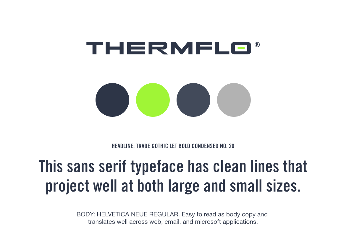
The new color palette was rooted in deep trustworthy colors but offset by bright green, reflecting the technological nature of their business but also evocative of “power” and ThermFlo’s promise that the “power is always on.” This comes to life in the logo incorporating an animated power button.
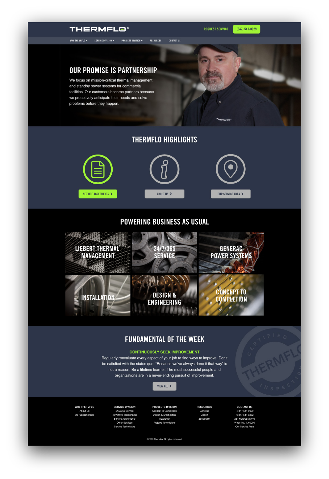
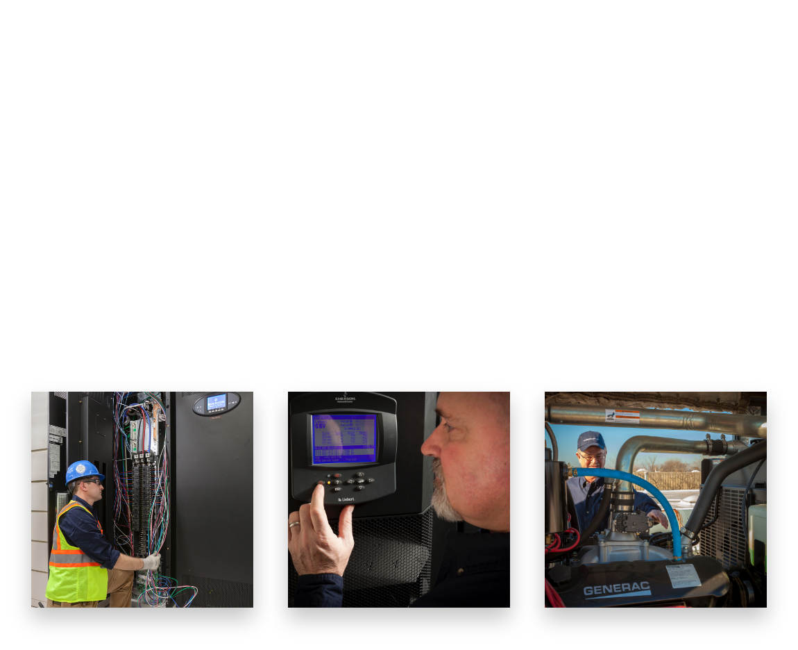
Motion shot new photography on location, highlighting ThermFlo’s service technicians at work, creating a new library of consistent imagery.
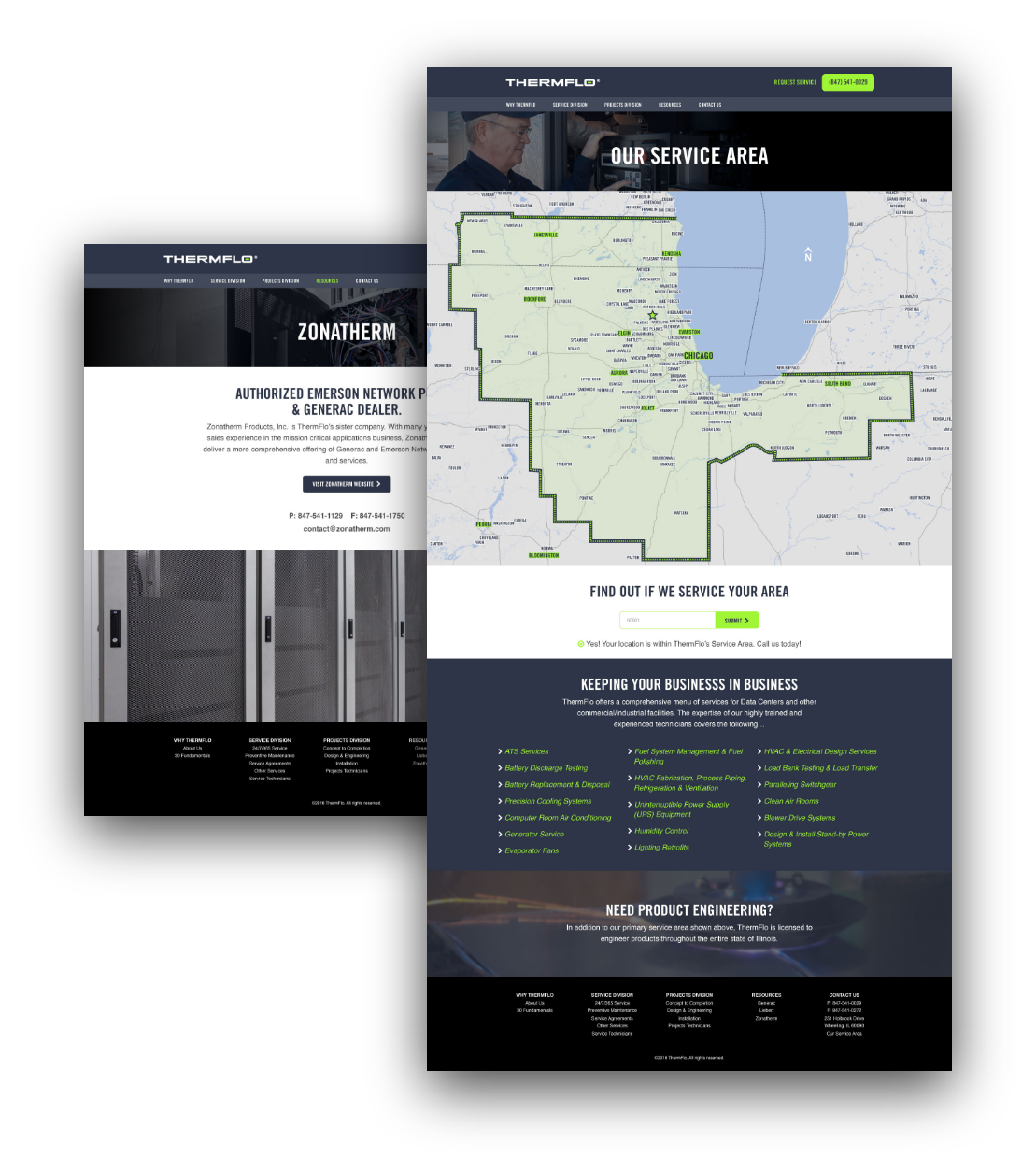
Enhanced map functionality was added to help their customers quickly connect with the right ThermFlo resource.
Related Work: